copernicus watchface
Copernicus
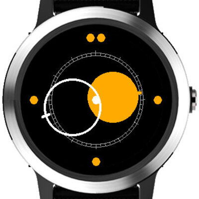
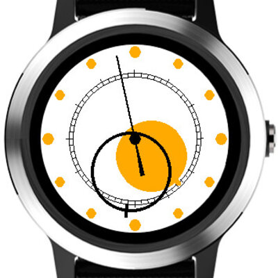
I acquired a Garmin Vivoactive 3, and was very unimpressed with the analog watchfaces available. Therefore I obviously had to make my own. It's an homage (copy) of the Raketa Kopernik/Copernic, and features a dark and light version, each a more or less faithful implementation of the original.
thoughts
Most watchfaces for Garmin watches are very busy or display a large amount of information, but for something I may wear all day, I don't think there's anything more immediately important upon looking at a watch than the time; everything else is more suited to the apps on the watch, or for review on the phone app.
The only clever bit of the code was deciding to calculate scaling and location of all things drawn on screen based on the pixel dimensions of the screen; this allows the watchface to run on all the Garmin watches, even though some are square, circle, lots of pixels, few pixels, 16 colors, 64 colors, etc.
I tried adding some interpolation/AA to make it look smoother, but it ended up blurry and also blew the power budget. Considering the size of the device, I think it looks fine without.
It has a few configurable options through the phone app; the arbor, seconds hand, and light/dark can all be switched on or off.
I'm pretty happy with it, the weird design of the watch is still readable, and the high contrast lets me leave the watch in no-backlight mode, which is great for battery life.

