design survey: indycar wing widgets
2022/05/15
a very niche bit of equipment
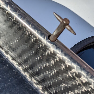
I was in the pits at the IndyCar grand prix of Indianapolis, and during some downtime noticed some little 3D printed things this year. The front wings for the cars are adjustable, and these adjustments are made by rotating a little winged bolt. These are rather pointy, and it's also important that the setting not get messed up while the wings are being carried around. At some point before going on the track, they need to be removed, of course. Somewhat surprisingly, each team has come up with their own design for a little plastic cover.
the things
I took pictures of them all, of course. Let's take a look:
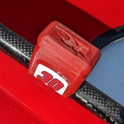
This one is the prototypical design to me. The Ur-thing: a rounded rectangular body, cutout inside to sit over the bolt, and semicircle cut to sit nicely on the wing. Team logo debossed, car number sticker on the side. Notched grip section. Color matches the car, which is nice but also makes it harder to spot.
Basically the same, but with a nice gaffer tape strip to improve visibility. Still matches the car colors, though.
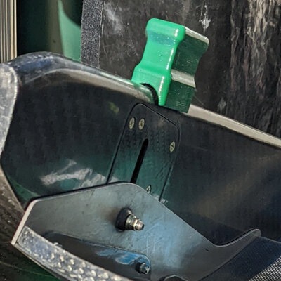
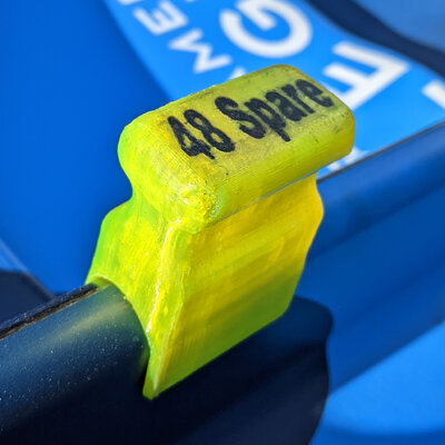
Slightly elongated design, but this time in a high vis yellow, and it also notes if this is the primary or spare wing (important info, they'll be set differently). However, it means that you can't swap them around if you mix or misplace them. Uses two colors of plastic; better than paint or a sticker since it can't rub off.
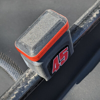
A little more rounded with a larger grip section. Label with white on black text for high contrast, but the text is a little small.
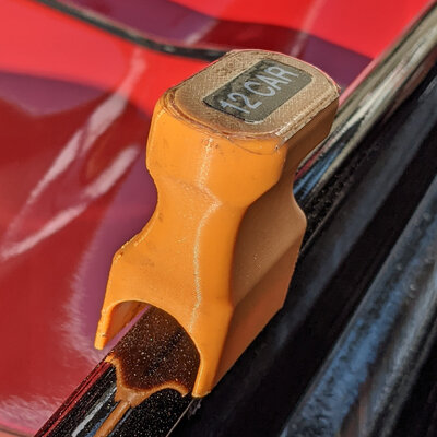
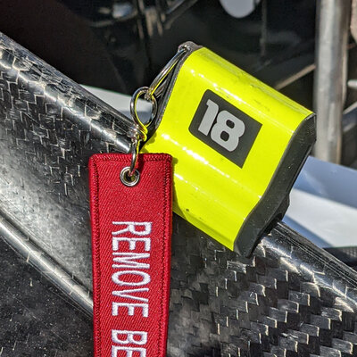
A slick, visually pleasing Y-shaped design, but I don't think this one is as easy to grip, especially with the tape. Has a "REMOVE BEFORE FLIGHT" tag, a little redundant in my opinion. High vis tape, but using a brighter plastic seems more sensible to me.
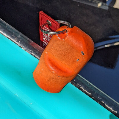
Rounded and taller than most, also has a hanger tag. Painted complimentary color to the car for maximum visibility. Looks like it was primed and painted, again I think just printing in orange would be better.
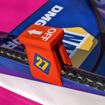
This is the only one with usage instructions! The others have to be removed with a pulling/jiggling motion, but this one slides. The removal on this one is directional, necessitating the indicator. It also didn't seem to stay in place as well as the other designs. I wonder if they tried to make it slide both ways but found it wasn't tight enough. I like the sliding motion, but making it directional (and requiring instructions) seems like a big flaw to me.
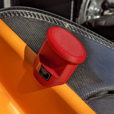
A rounded mushroom shape with a deep grip. Nice solid design, can't complain much. Maybe a different color to stand out more against the orange car would make sense. Has a label on it, not sure what "7B/U1" means.
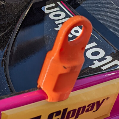
This is my favorite! A little bigger, rounded, and the grip cutout seems a little shallow. But the big loop at the top means you can pull on that, and also makes it easier to keep track of: when removed, it was hung on a hook. A larger overall size has benefits: easier to grab, and also to keep track of in a busy racing environment. Since it's a niche, one-off item, there's no reason to optimize dimensions down for cost or production time. On the other hand, it does stick out a lot further than any other design here, risking it getting bumped during transportation. I think it could be shrunk a little.
conclusions?
In my absolutely armchair opinion, an "ideal" design:
- flouro yellow (or other color maximally dissimilar to the car)
- car number multi-material printed big on the top (but no primary/spare text)
- the standard rounded rectangle form
- loop on the end (not the top) for hanging nicely, while not changing the necessary grip or making it too tall
